As Plato once said, beauty is what works.
I agree. Especially in a sales environment.
Aesthetics, of course, play an important role; however, without practical function, any object loses its purpose. The daily mission of every professional working in design, architecture, and communication is to unite these two concepts in a way that creates a fluid experience for those inside the brand and those who consume it.
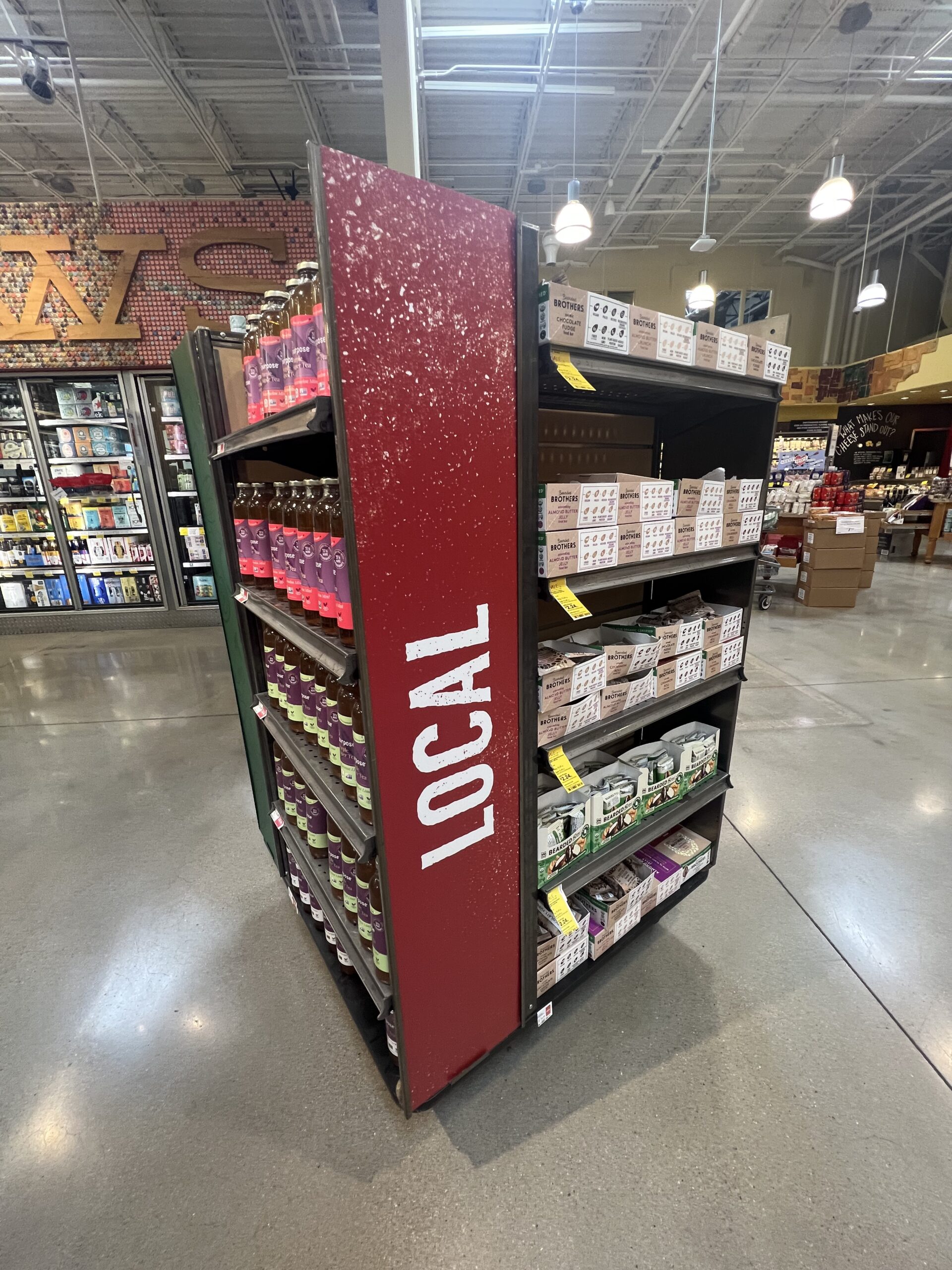
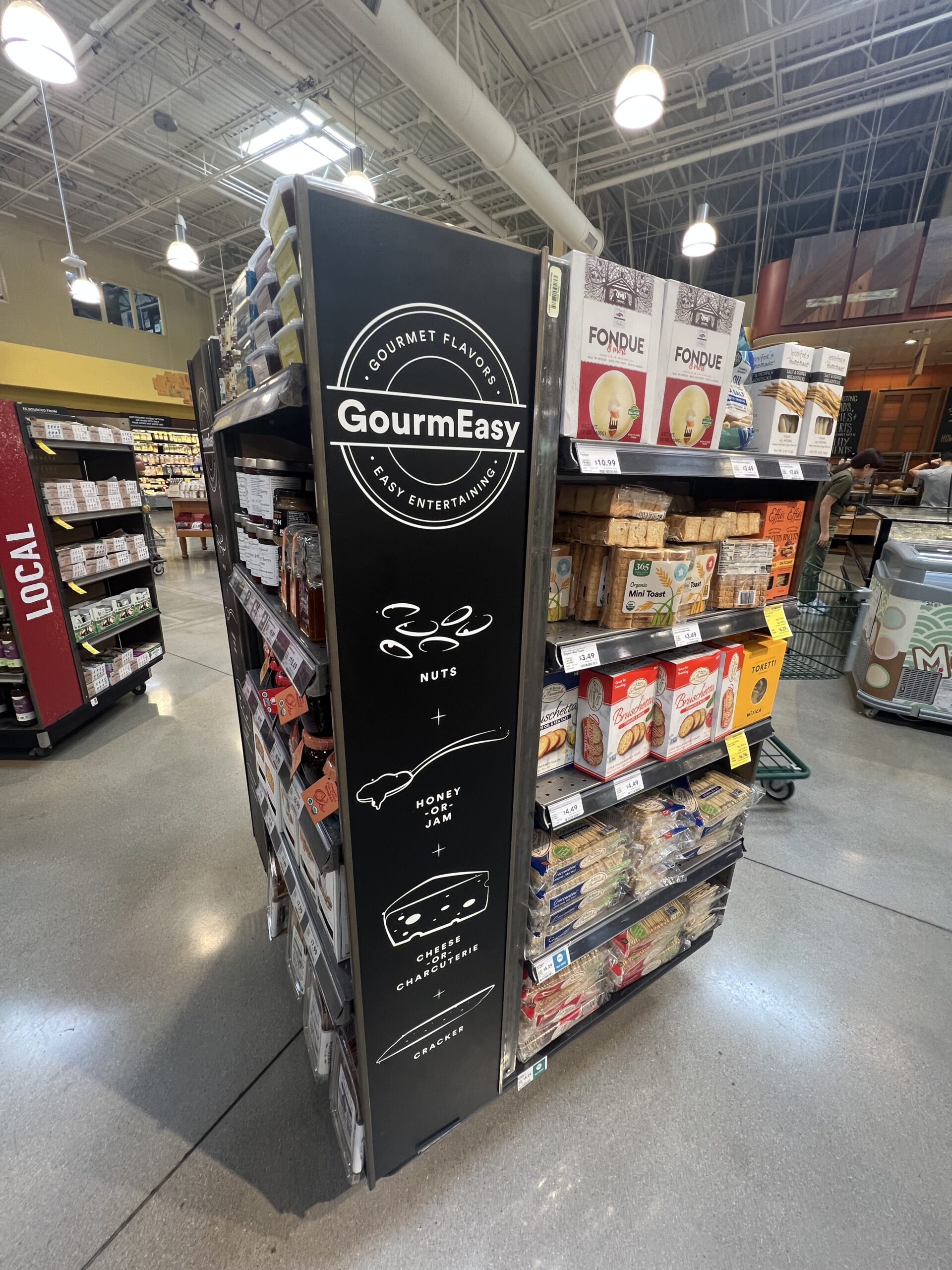
I’ve been following Whole Foods for years. They’ve always been very skilled in store dynamics, product displays, and visual merchandising. So much so that they became a benchmark and were acquired by Amazon in 2017. On a recent visit to their store here in my neighborhood—Cinco Ranch, Katy, TX—I was surprised to see how the brand has adapted its visual merchandising pieces. In the past, their furniture and hardware (the structures that support visual communication) were robust and unique, giving the impression that they were custom-made for each unit.
What I saw on this recent visit, however, was a radical change. The current approach allows for frequent updates of lightweight communication materials, featuring clever and functional solutions that provide this flexibility without compromising the structural elements. In terms of production costs, logistics, and execution time, the impact is certainly substantial. We know Amazon’s management style focuses on cost reduction and scalability. I believe this may be one of the main drivers of this change. Since acquiring Whole Foods, Bezos’ company has made several changes to enhance the chain’s profitability. It’s clear, for instance, that their stores have become more aggressive with discounts and promotions—something that wasn’t typical before.
The brand is committed to providing healthier food to people, and its supplier base has expanded. However, this expansion comes at a cost, particularly since Whole Foods has always been viewed as expensive—a perception that, post-pandemic, impacts even higher-income consumers. Moreover, competition has intensified. More upscale chains have excelled in product selection, combining it with experience and convenience. This landscape increasingly pressures Whole Foods to adjust its cost structure.
What’s the twist?
Despite all these cuts and savings, the outcome of their visual merchandising management could have been a disaster. But it’s not.
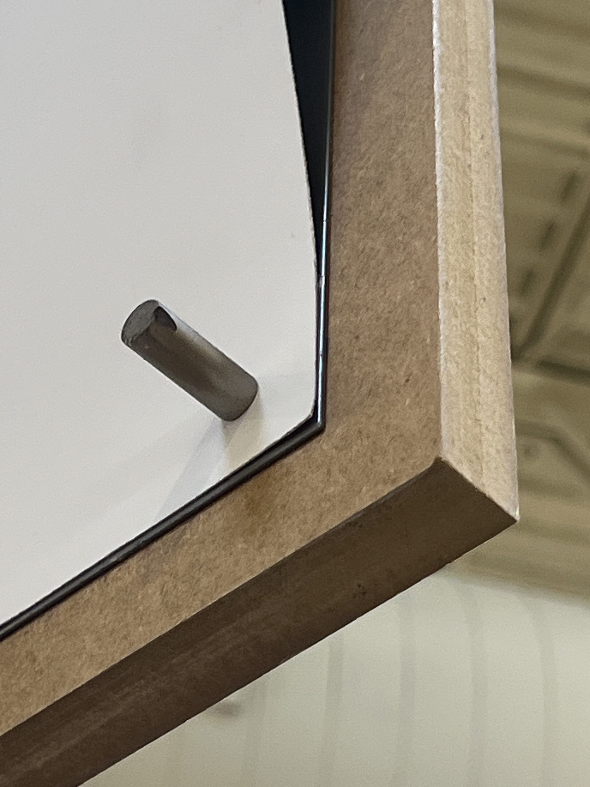


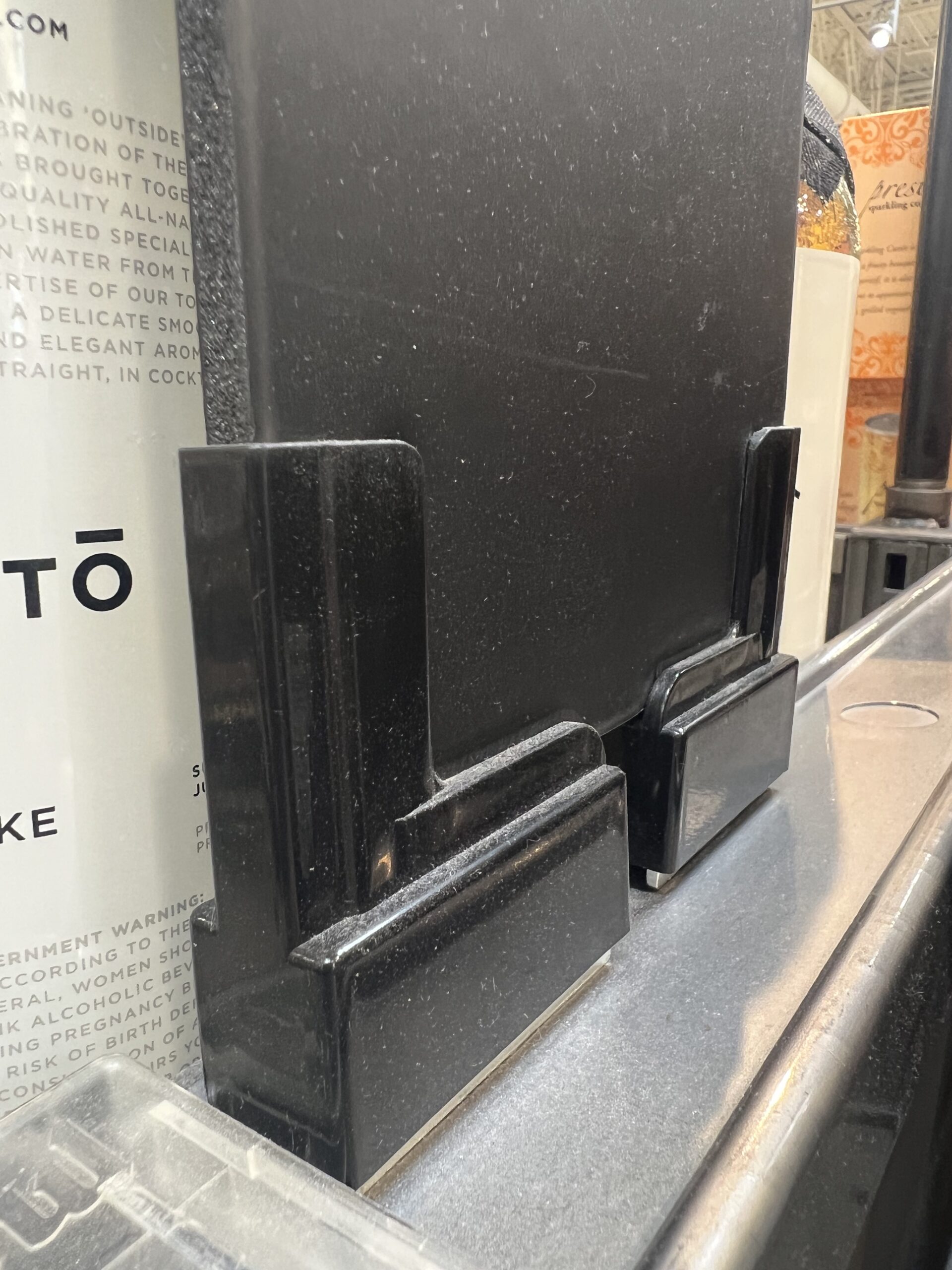
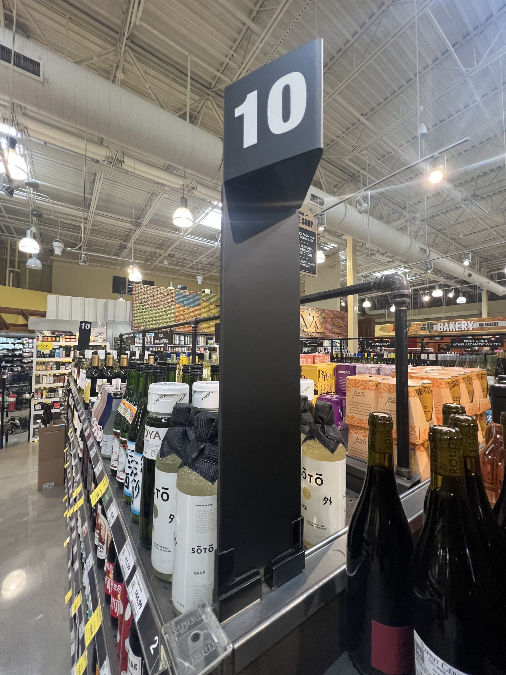
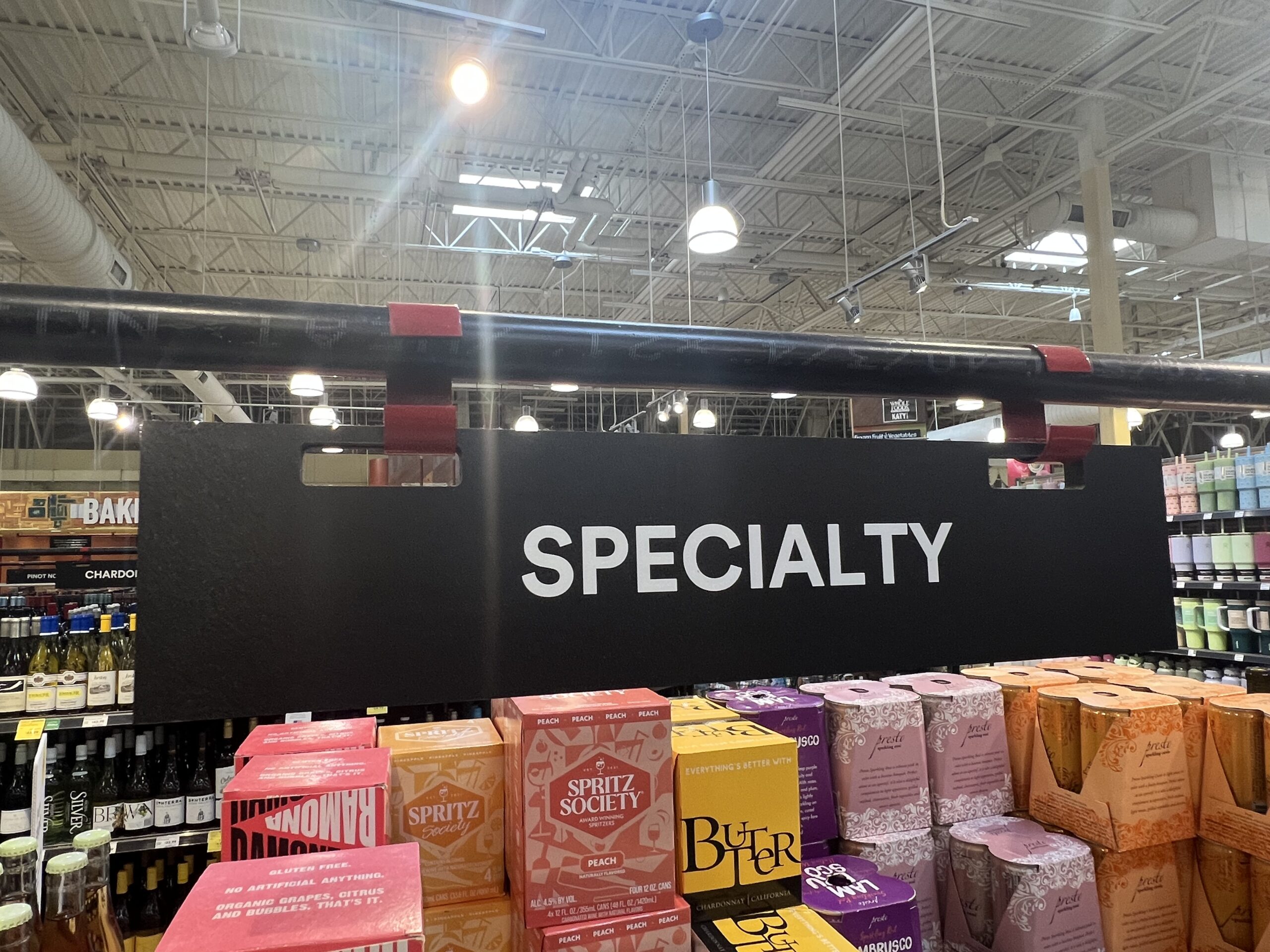
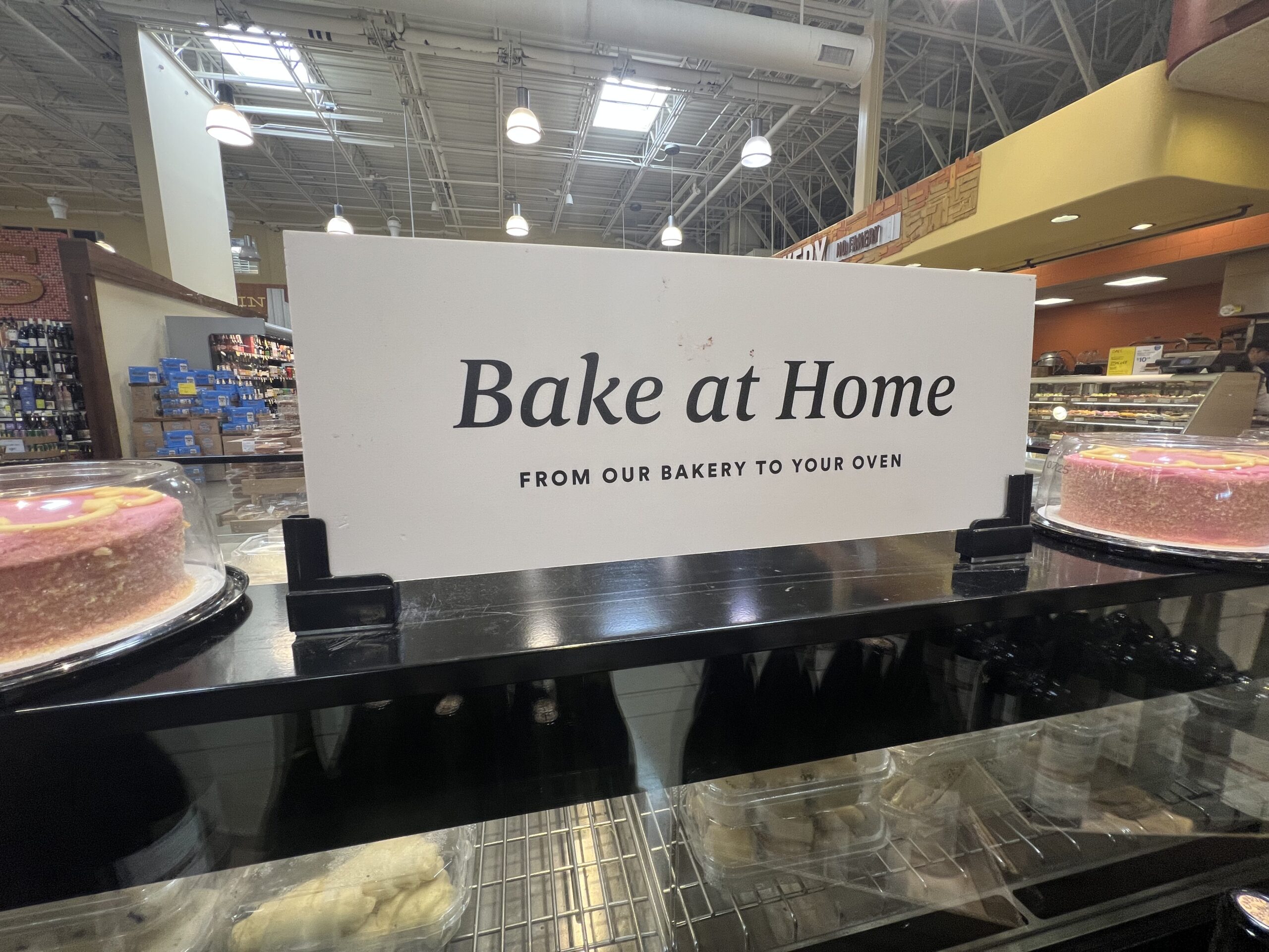
The furniture and materials are well designed. Only a trained, attentive eye can detect the reengineering of the new fixtures and storage furniture. The finishes are well executed, and the structures fully support communication, allowing everything to fit together harmoniously. Another interesting point is the use of supports in various areas for distinct types of communication, which helps optimize production costs while streamlining the implementation process on the shop floor.
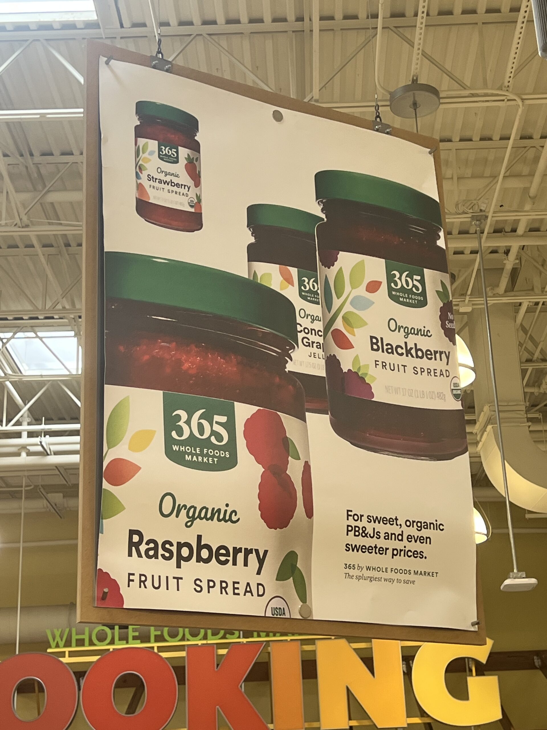
Nothing appears improvised, from magnetic panels to slatwall inserts and from paper to expanded PVC. It may be simple, but it’s not simplistic. Anyone who experiences the day-to-day of retail knows that this level of dynamism in managing visual communication is essential. It greatly simplifies the store team’s routine, from the manager to the shelf stocker. Along with agility, this smart visual merchandising also brings control: the communication templates and applications are standardized. This is crucial to avoid “creative outbursts” from store staff and improvised solutions that don’t align with the overall strategy.

That’s the magic of retail architecture and design created by professionals who understand the operational dynamics of stores and consumer behavior. You need to think from the inside out and the outside in. It must work for both the brand and the shopper. This systemic vision is demanding and requires deep expertise. Ultimately, when all of this also saves a lot of time and money, we can confidently say: there is ROD—return on design. What a twist!