One thing that catches my attention here in the USA is the sheer size of furniture stores. I agree that I shouldn’t be surprised anymore, given that American retail tends to go big in everything. I once heard the US retail executives joke about Brazilians, saying we are a big country with small stores. However, this scenario has changed significantly in Uncle Sam’s land in recent years, especially after the pandemic and the click-to-brick movement (online retailers transitioning to physical retail). Stores have reduced in size due to several factors, such as labor shortages, rising rental costs, and better assortment optimization thanks to BI tools.
Anyway, this article is not about that. Back to the point, one furniture store caught my attention for its ability to create a smooth shopping journey in a huge environment that could easily be exhausting, confusing, and frustrating. The retailer in question is Living Spaces, a Californian brand founded in 2003, with 40 stores across eight states in the western USA. Interestingly, the first unit was opened as a showroom-warehouse in a building previously occupied by Costco.
The company is far from being one of the largest retailers in the furniture segment, which includes giants like Ikea, Ashley Home, and Williams-Sonoma, to name a few. It doesn’t have the charm of a Pottery Barn, the trendy design of a West Elm or Design Within Reach, or the tradition of a Restoration Hardware or Crate&Barrel. But that’s not its aim. Still, it manages to pull off the challenging task of giving some charm to furniture pieces in an environment of over 140,000 square feet. The risk of it looking like an upgraded flea market or a furniture warehouse is pretty high.
But that’s not what you see.
What’s the Twist?
Generally speaking, the store is a set of good ideas that work well. It meets the basic needs of an ideal shopping journey. The person behind this dynamic did their homework, identified some pain points in the segment, and packaged them well.
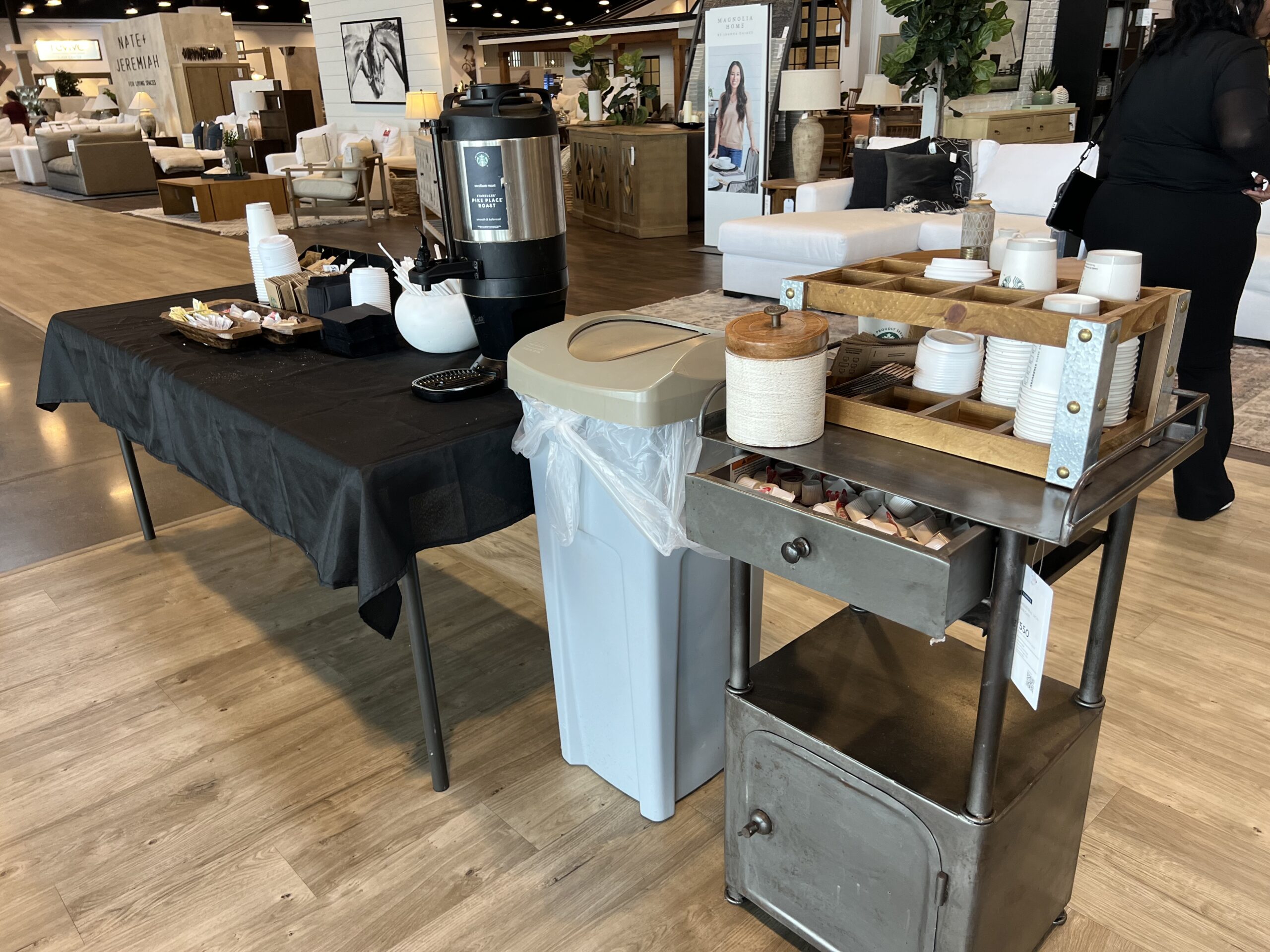
There’s a Starbucks station at the entrance to welcome customers (I admit it could be a bit better resolved and set up, but it’s better done than perfect). The overall layout of the major categories isn’t groundbreaking, and I can’t imagine how it could be different. Everything is well-signposted, clearly, with good readability, and visually pleasing.
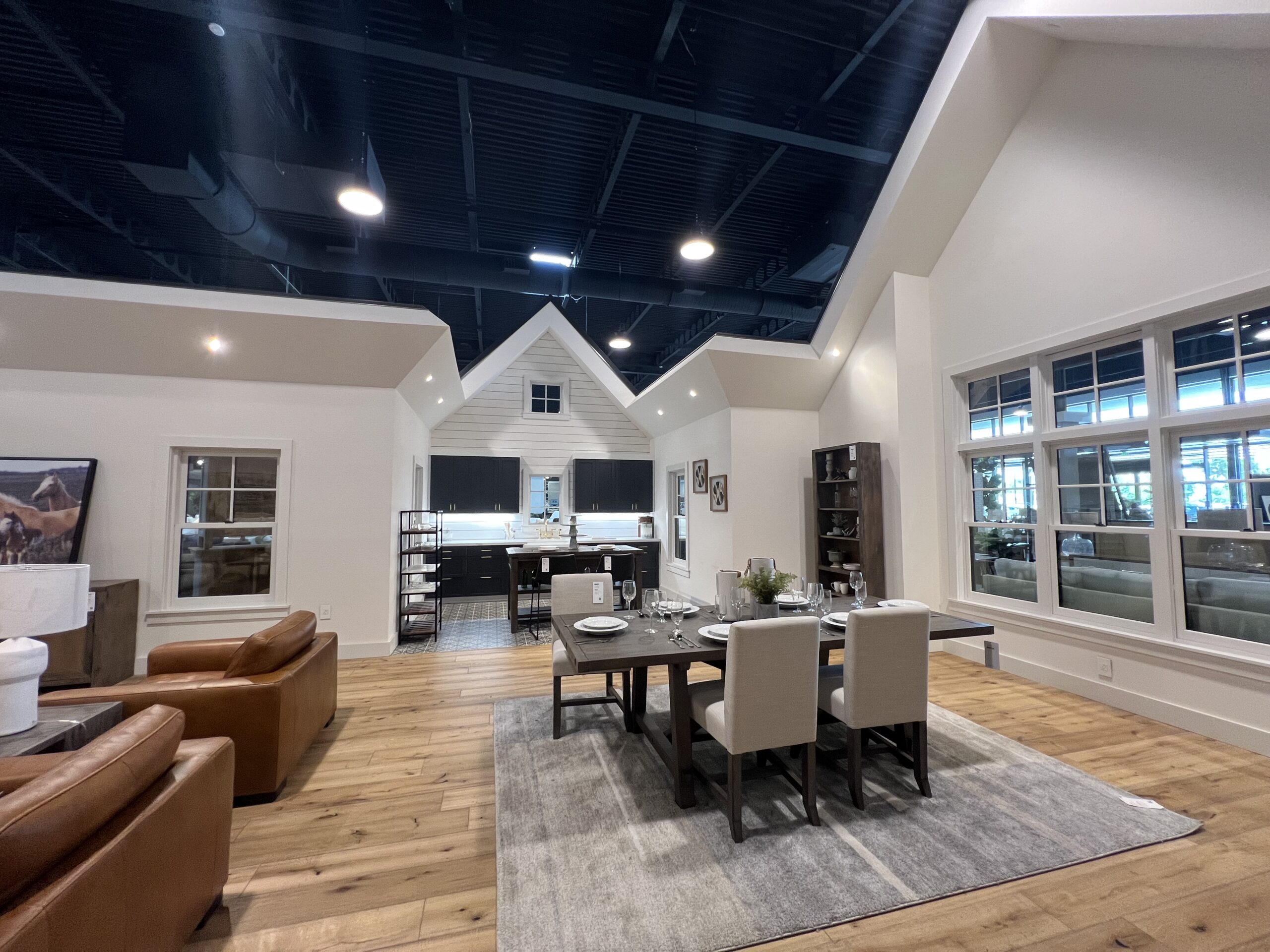
The main attraction of Living Spaces, made possible by the store’s large dimensions, is literally four houses of different styles with various furnished rooms in the center of the store. The visual impact is fantastic. In addition to breaking the feeling of emptiness in a place with 60-foot-high ceilings, it creates a focal point that helps with navigation. The houses have no ceilings, so there’s no feeling of confinement or tightness when you’re inside. Very well-decorated, the environments differ in contemporary, classic, country (after all, we’re in Texas), and Hispanic styles (again, because we’re in Texas).
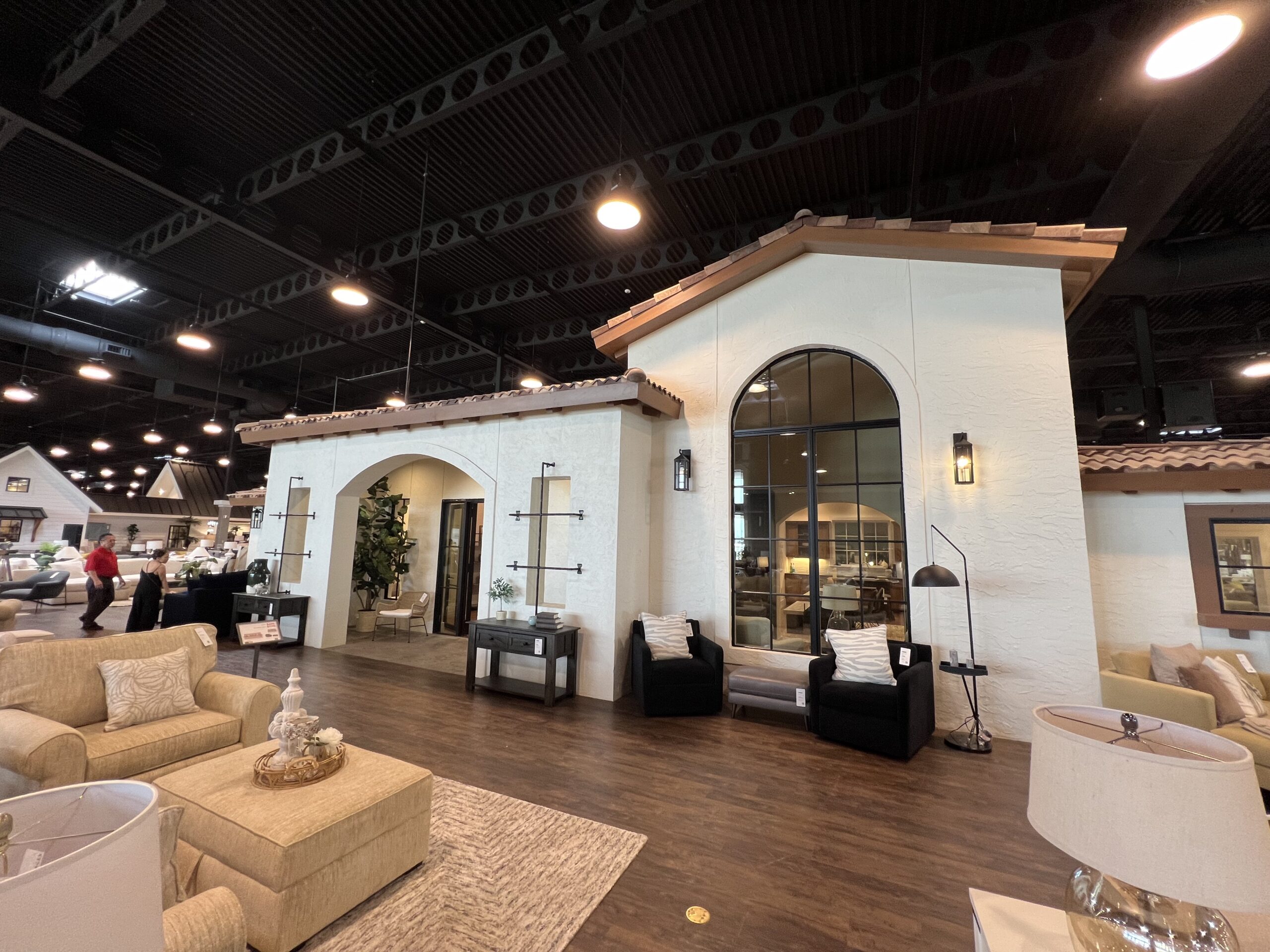
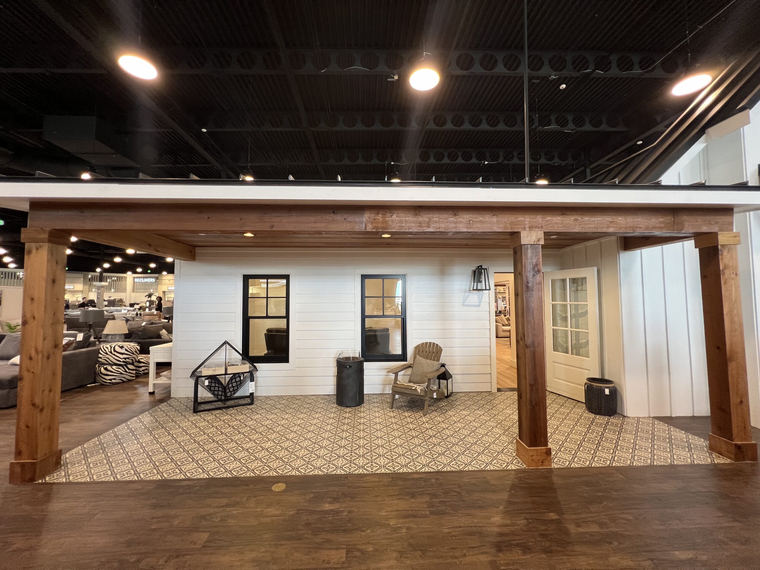
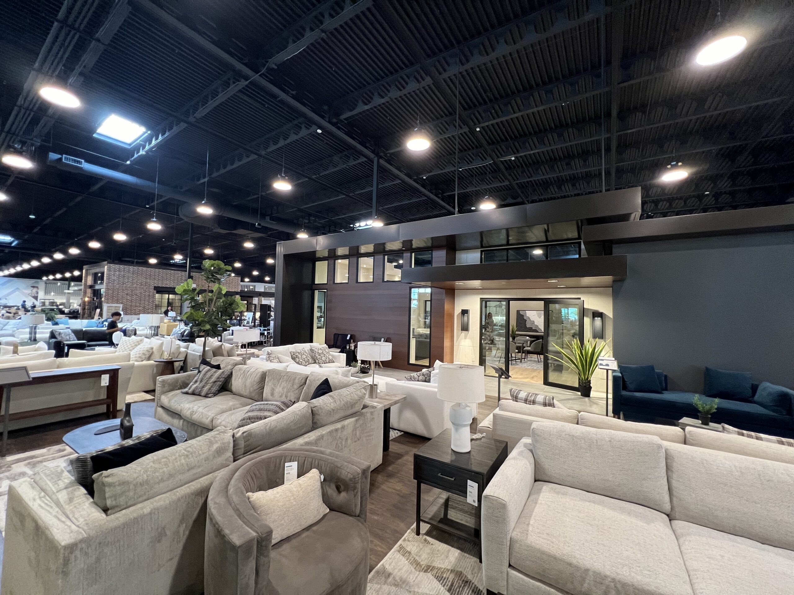
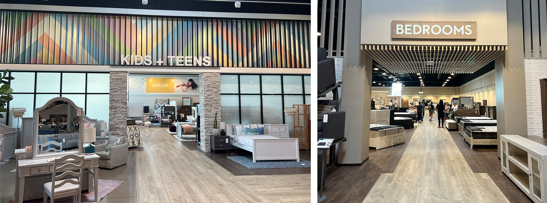
The area around the houses is filled with micro-environments. The store does a great job of signaling departments, creating easily understandable zoning. The kids & teens section is an example of this. Another area that’s given plenty of space is the bedrooms and mattresses, undoubtedly because of the products’ profitability and high competition in this segment.
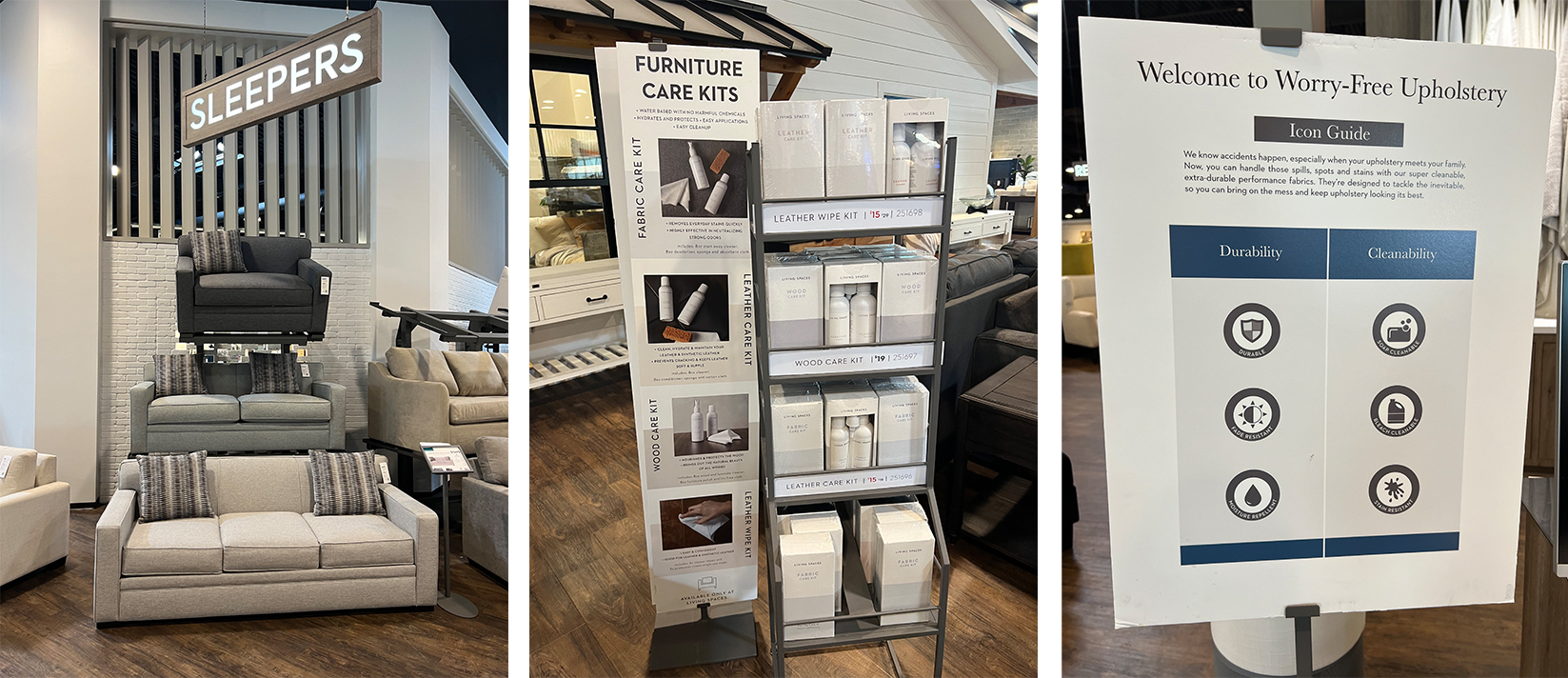
The hardware used to display sofas and armchairs is smart, discreet, and functional, never giving the impression of overcrowding or overload. They also offer accessories for furniture maintenance and cleaning as an add-on line of products in a well-organized display. The visual merchandising is clear and features icons that help identify the characteristics of the displayed pieces.
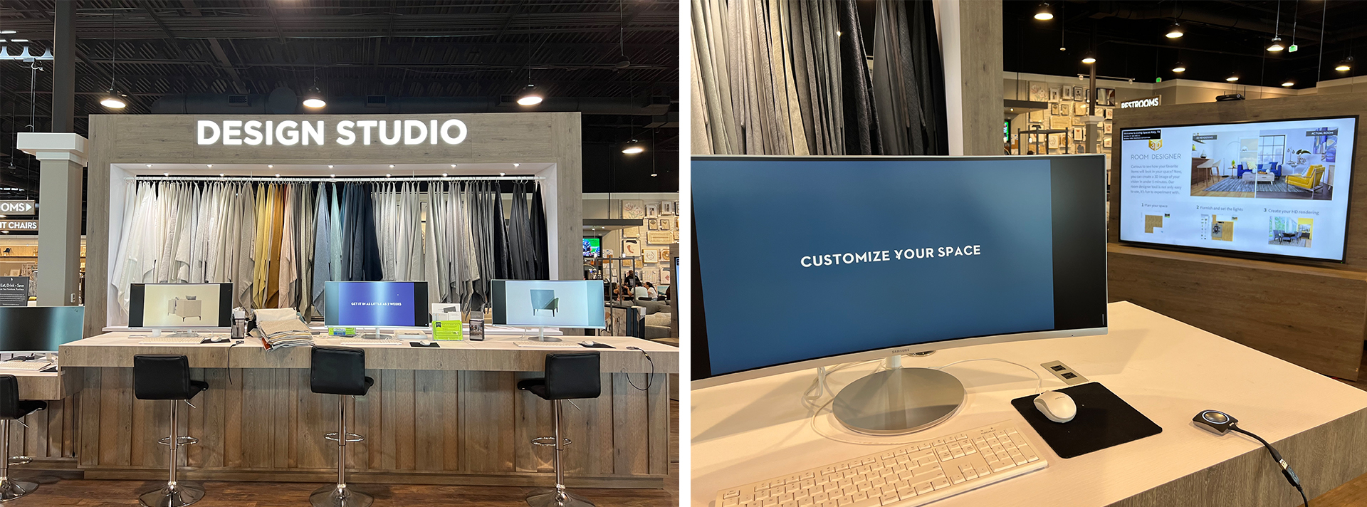
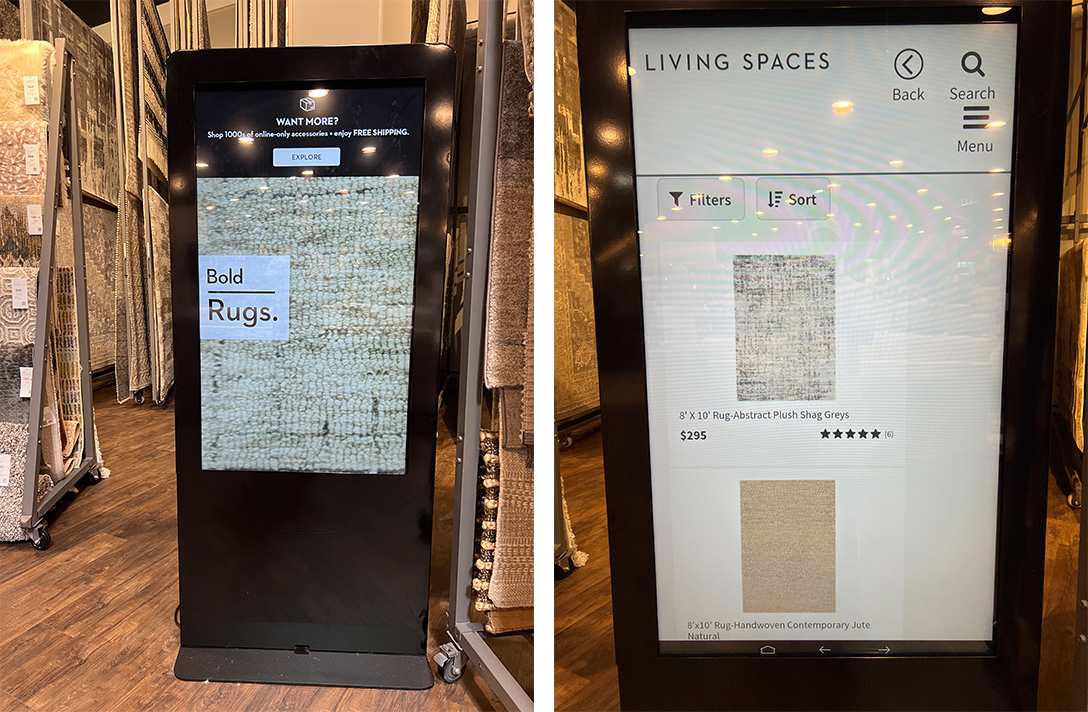
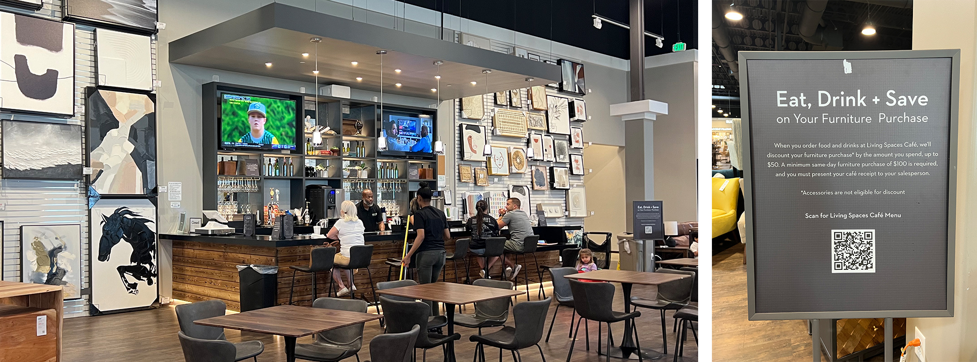
Of course, the store offers project customization at a workstation in the middle of the environment. An Endless Aisle is also available in the rug section, using an intuitive and functional tool. Like any good retail space, there’s also a food area and a kids’ space. But unlike many places, nothing feels improvised. The café is more like a sports bar, with two large TVs showing games, alcoholic drink options, and various dishes. A cool feature is being able to deduct your café purchases from your furniture bill up to $50. A clever way to encourage spending. And it’s all well-integrated into the artwork section—super strategic for those sitting and enjoying a coffee while getting inspired to buy a piece of art. Smart.
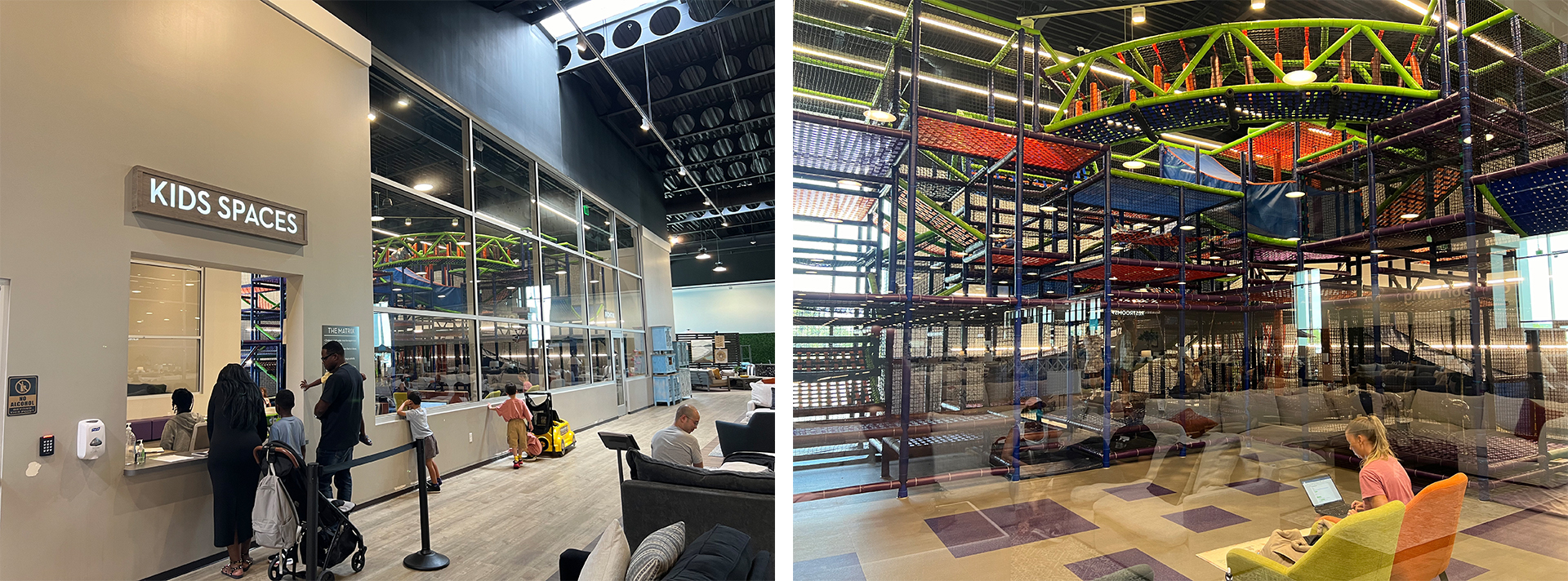
The kids’ area is enormous. Entry is organized, and the number of people is limited to keep the environment healthy. Inside, there are armchairs where parents can comfortably watch their younger children.
I can’t fail to mention the brand’s efforts with communities. In addition to donating mattresses, they work in partnership with various NGOs to provide projects and furniture to orphanages, victims of California wildfires, and war veterans.
Someone familiar with the store who reads this article might think, “Wow, I never noticed anything special about this store.” Indeed, compared to the brands I mentioned earlier, Living Spaces doesn’t outperform them in any of those aspects. In my view, however, it manages to harmonize various elements of a good shopping journey in a creative, simple, and functional way.
Does it need more than that? What a twist.
